Which design principles did you use to create your infographic in Canva? Which elements of a ‘good infographic’ were you able to incorporate? What other principles did you consider?
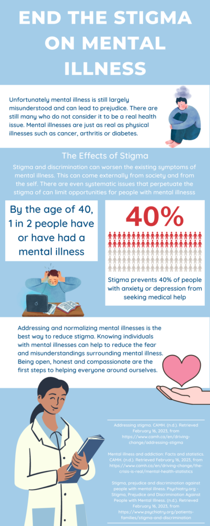
While I made this infographic I primarily kept in mind the uses of color and contrast throughout. I kept my colour palate limited primarily to two shades of blue and white. To help add some contrast I used red in the statistic portion to draw interest and focus to it and to break up the blue. I also attempted to balance out my graphic elements within the graphic having them stagger down the graphic and making sure nothing was too crowded. Since my infographic is more on an educational infographic it does have a lot of text which can make it a bit crowded. Something that I could improve on is limiting the text or wording the information in a way where only the very important bits of information is shown. I also wish I could have found a series of graphics that would have fit better. The free graphics available through Canva are very useful, but sometimes its hard to find graphics that suit your topic and match.
Where do you see constructive alignment and backward design used in this course or another course you are taking/have taken? Is there anywhere where it seems to be missing?
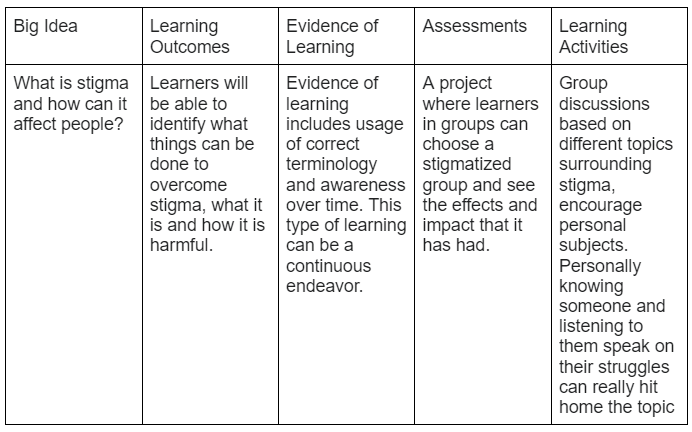
To continue with the theme I made my lesson plan surround the concept of stigma. It was a concept that was introduced in another class that I am taking this semester. The concept of Constructive Alignment and Backward Design seems to be something common throughout my education. Most classes that I have experienced follow the same sort of flow of understanding what we are intended to learn and following through with some sort of assessment and/or learning activity that allows us to put our learning into practice.
Leave a Reply
You must be logged in to post a comment.