The video that I have made for this assignment is based on another video assignment being done for another class. Since this other assignment is a group project and is still in progress I decided to focus my video on specifically the section that I worked on which was the history of harm reduction. With this video it is presented more as an educational presentation with a slideshow presentation. Majority of my updates and changes made were to the slides and the visuals. Both presentations were made through Canva and utilized its library of icons and other elements.
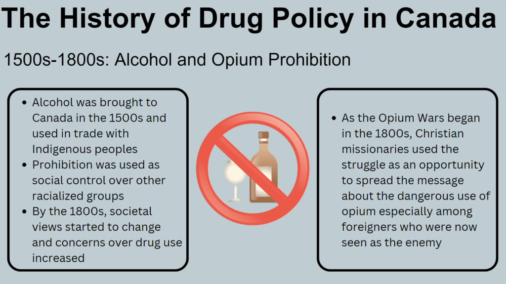
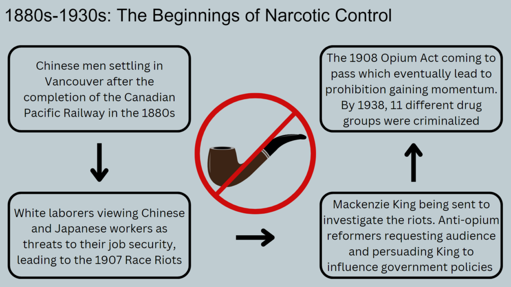
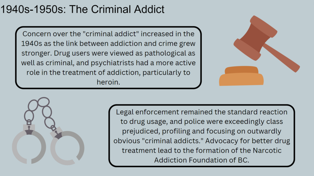
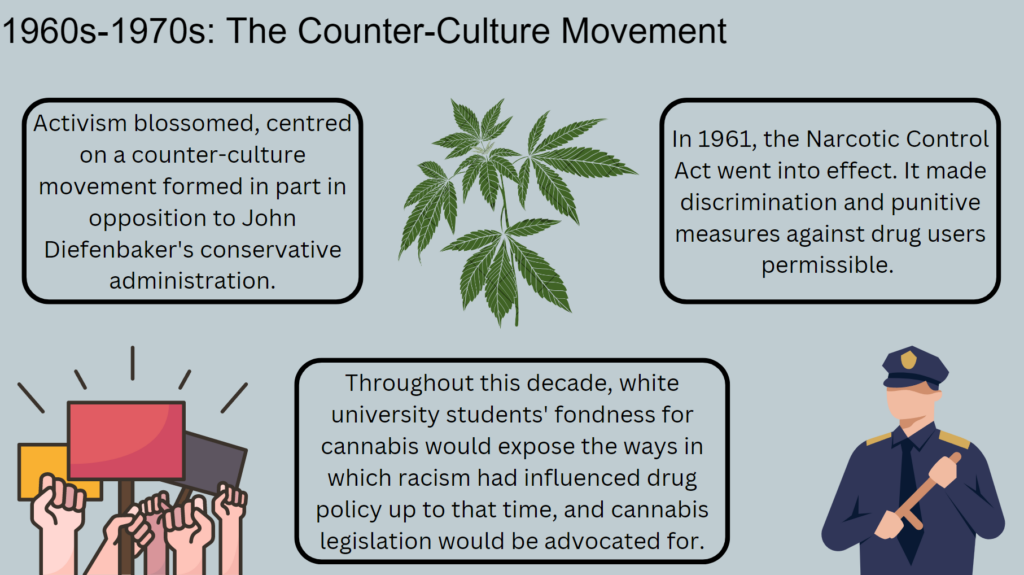
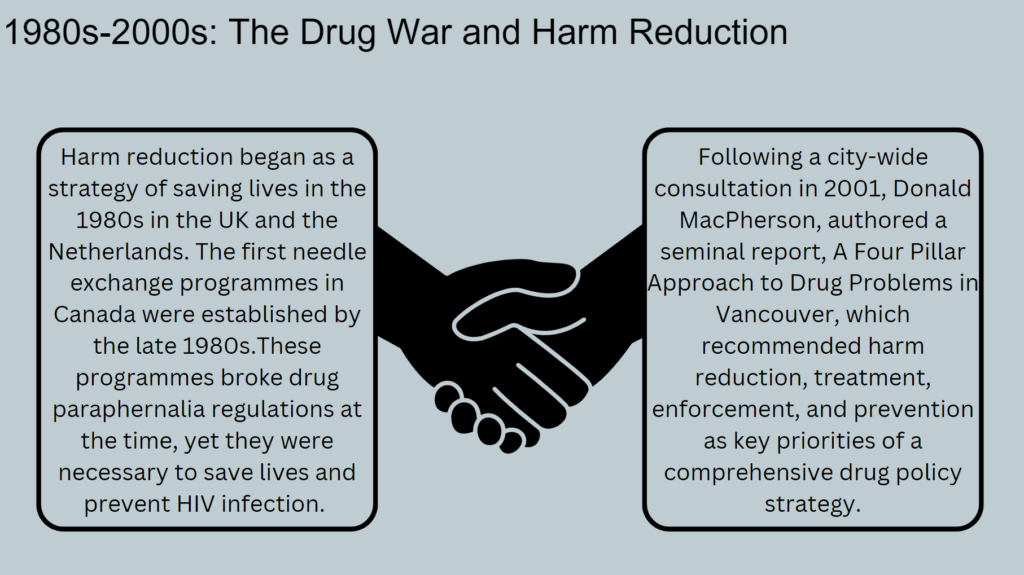
Below are the original slides that are being used for the other video assignment
The updated presentation was primarily updated design wise, particularly the principle of contrast was kept in mind. The original presentation is a group project that already had a theme by the time that I had started to work on it, so I worked with what the other members had added to make my part cohesive with everything else that was added. When updating the presentation I wanted to make all my visual elements cohesive. To accomplish this I stuck to a black and white theme so that it would be easier to find and edit the visual elements to better match each other. Other than that added a slide to explain the topic better and added a intro and conclusion slide. The new topic slide sort of brings Mayer’s principle of pre-training to the video as it sort of better prepares the listener to the rest of the video.
The layout remains largely unchanged as I quite liked it and the information that I added. Though I do understand that these two presentations do not follow the multimedia learning principles to the T. They do show a decent segmentation of information in different time periods and the video allows the listener to scroll back to replay parts for better learning. The Cognitive load principle could be better executed as there are visuals, text and narration, though I attempted to make it easier by keeping the ideas separated in the text boxes and with more simplified visuals.
If I were to further improve this presentation again, I might highlight certain pieces of text to utilize the signaling principle and further point out the important bits of information. I had not thought to do this before completing the video. I would perhaps also try to further reduce the text in each slide as a lot of it is redundant, but I find it hard to follow the redundancy principle in more educational types of videos and presentations.
What ethical concerns do you have (or not have) about the use of some of these [AI] tools?
There are some legitimate ethical concerns regarding use of some of these AI tools. There are some tools such as Quillbot and other types of text generation tools that can be used and are even advertised to students to use to write their papers and assignments for them. While these advertisements are unlikely to directly promote academic violations, should students actually submit just the work that is generated by these tools with no other type of proper citations or accreditations that can be a taken as plagiarism.
There are also the image generation AI tools that are available to many. Many of these tools will be trained on images and art available on the internet and art sharing websites like DeviantArt without the consent of the creators. This poses an ethical concern of people using these tools and training them using certain artists works and putting it out as their own original work. This discredits and ignores all the time and skill that people put into their creations and for some it takes away from their livelihoods.

How accurate or successful were the learning objects you created using the AI tools?
I utilized the two image generation AI tools Stable Diffusion and DALL-E in my testing. I was interested to see how similar or different the two AI tools would respond to the same prompt. I did this test with a few different prompts. Most of my prompts were taking modern objects or characters and showing them in a traditional art style. Below are the images generated with the prompt “Hatsune Miku in the style of Picasso”. Some other prompts I had were “modern gaming PC in the style of Monet” and “squishmallows in art nouveau”. These other prompts produced images that weren’t as coherent as the images presented below. They may have vaguely looked like what the prompt was requesting, but only with the context of the prompt. With the images below I found that the Stable Diffusion images had textures that mimicked traditional paintings compared to DALL-E’s images having purely flat colours. Overall it seems like Stable Diffusion was more successful with my prompts and provided more detailed images, likely due to having a larger database to draw from and taking longer to generate the images. Although I have to say that the final image that DALL-E provided might be my favourite.


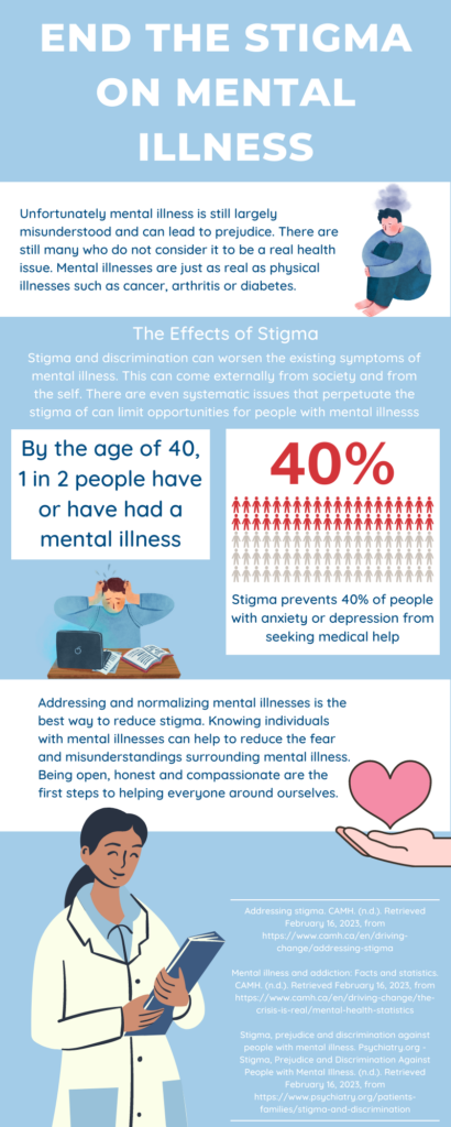
Which design principles did you use to create your infographic in Canva? Which elements of a ‘good infographic’ were you able to incorporate? What other principles did you consider?
While I made this infographic I primarily kept in mind the uses of color and contrast throughout. I kept my colour palate limited primarily to two shades of blue and white. To help add some contrast I used red in the statistic portion to draw interest and focus to it and to break up the blue. I also attempted to balance out my graphic elements within the graphic having them stagger down the graphic and making sure nothing was too crowded. Since my infographic is more on an educational infographic it does have a lot of text which can make it a bit crowded. Something that I could improve on is limiting the text or wording the information in a way where only the very important bits of information is shown. I also wish I could have found a series of graphics that would have fit better. The free graphics available through Canva are very useful, but sometimes its hard to find graphics that suit your topic and match.
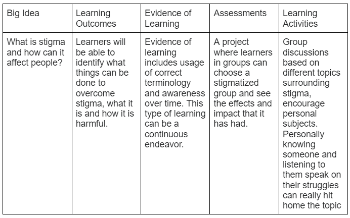
Where do you see constructive alignment and backward design used in this course or another course you are taking/have taken? Is there anywhere where it seems to be missing?
To continue with the theme I made my lesson plan surround the concept of stigma. It was a concept that was introduced in another class that I am taking this semester. The concept of Constructive Alignment and Backward Design seems to be something common throughout my education. Most classes that I have experienced follow the same sort of flow of understanding what we are intended to learn and following through with some sort of assessment and/or learning activity that allows us to put our learning into practice.
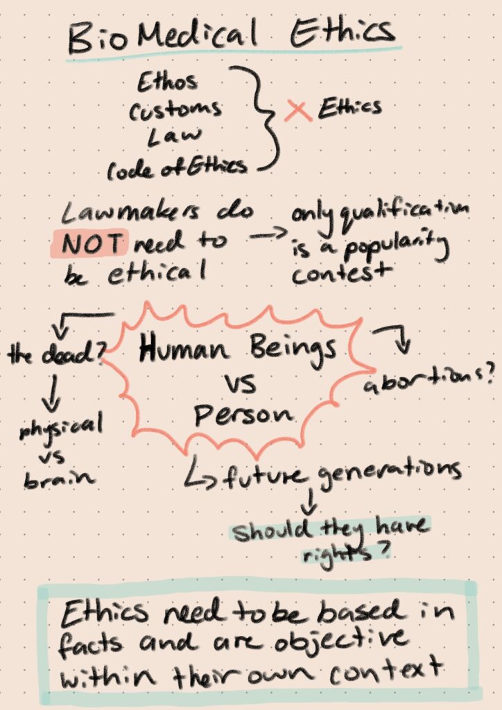
How did sketchnoting change your ability to recall the information you were documenting?
When sketchnoting I definitely found that breaking down the thoughts that I had in class into important bits of information was more effective. I did my sketchnote during the lecture itself and found it difficult to add things like images or little pictures throughout the note. I instead stuck to things like symbols, outlines and arrows. This would probably be better used as a studying technique to review your notes after a lecture. I am still able to recall most of the information from the lecture when I go over the sketchnote. It is also much easier to read and review a sketchnote instead of a block of text.
How would you incorporate it into a learning activity?
A learning activity that could have sketchnoting incorporated into it is a memory test. I remember in a psychology class when I was in highschool we were discussing how people remember things and my teacher had us try to repeat the information in a block of text, but we were only allowed to make a limited amount of notes. Sketchnoting could be used to make the notes and we could see the difference between how much information that can be recalled in making limited text notes and sketchnoting with the same limit of words but allow the inclusion of images and symbols that are utilized in sketchnoting.
Howdy hey, I’m Sherry. I am a 4th/5th year Health Information Science student on my last study term. After this semester I will have one more co-op term before I am set to graduate, which I am very excited for! I am simply just a funky little guy trying to find my way through life. Most of that life so far has been sat in front of a computer screen playing video games and binge watching anything I can grab my grubby little claws on ;-;. So why not at least learn somethings while I listlessly watch a YouTube video on my second monitor.

The principle that resonated with me the most out of the 4 principles from Mayer’s Theory, that were introduced this week, was the coherence principle. Staying on topic is something that I really struggle with and it can show in my writing and when I speak to people. It can make presenting difficult when I find myself focusing on a tangent that has no right taking up as much time as it does. Although I find it is definitely an issue that not just I struggle with. There have been many lectures that I have attended that have me thinking “why are we talking about this now and how is it important to the subject?”.
Welcome and Introduction
Before proceeding with this first blog post, we expect you to consider your privacy preferences carefully and that you have considered the following options:
- Do you want to be online vs. offline?
- Do you want to use your name (or part thereof) vs. a pseudonym (e.g., West Coast Teacher)?
- Do you want to have your blog public vs. private? (Note, you can set individual blog posts private or password protected or have an entire blog set to private)
- Have you considered whether you are posting within or outside of Canada? This blog on opened.ca is hosted within Canada. That said, any public blog posts can have its content aggregated/curated onto social networks outside of Canada.
First tasks you might explore with your new blog:
- Go into its admin panel found by adding /wp-admin at the end of your blog’s URL
- Add new category or tags to organize your blog posts – found under “Posts” (but do not remove the pre-existing categories or sub-categories). If you would like to add more course categories, please do so (e.g., add EDCI 306A with no space for Music Ed, etc.)
- See if your blog posts are appearing on the course website (you must have the course categories assigned to a post first and have provided your instructor with your blog URL)
- Add pages
- Embed images or set featured images and embed video in blog posts and pages (can be your own media or that found on the internet, but consider free or creative commons licensed works)
- Under Appearance,
- Select your preferred website theme and customize to your preferences (New title, etc.)
- Customize menus & navigation
- Use widgets to customize blog content and features
- Delete this starter post (or switch it to draft status if you want to keep for reference)
Do consider creating categories for each course that you take should you wish to document your learning (or from professional learning activities outside of formal courses). Keep note, however, that you may wish to use the course topic as the category as opposed to the course number as those outside of your program would not be familiar with the number (e.g., we use “Multimedia Learning” instead of “edci337).
Lastly, as always, be aware of the FIPPA as it relates to privacy and share only those names/images that you have consent to use or are otherwise public figures. When in doubt, ask us.
Recent Comments